The Queen Elizabeth University Hospital has 1000 beds over 14 floors, with thousands of daily visitors. So it needs a good way for people to travel up and down the building.
And the lift system appears to be cleverly designed. It’s one with no buttons to press on the inside of the lift. Instead, the user calls the lift they need by selecting a floor on a panel outside. This panel then shows them which lift to take, based on available capacity. Simple.

This seems like a smart way to distribute people between the 6 lifts in the most efficient way. What’s more, the design anticipates a few different use cases:
- A person in a wheelchair may need more room than a person standing, so there’s a button for that
- A group of people take up more room than a single person, so people in groups can indicate how many people are in their group
But maybe other lift users aren’t as interested in lift system design as I am. Some people still get into the first lift that arrives anyway; groups of people rarely indicate so; plenty of people just stand around waiting and scratching their heads.
The design appears to break most people’s long established mental model for how they expect lifts to work. And to compensate for this, a rich ecosystem of signs and posters has evolved on the walls outside each lift:
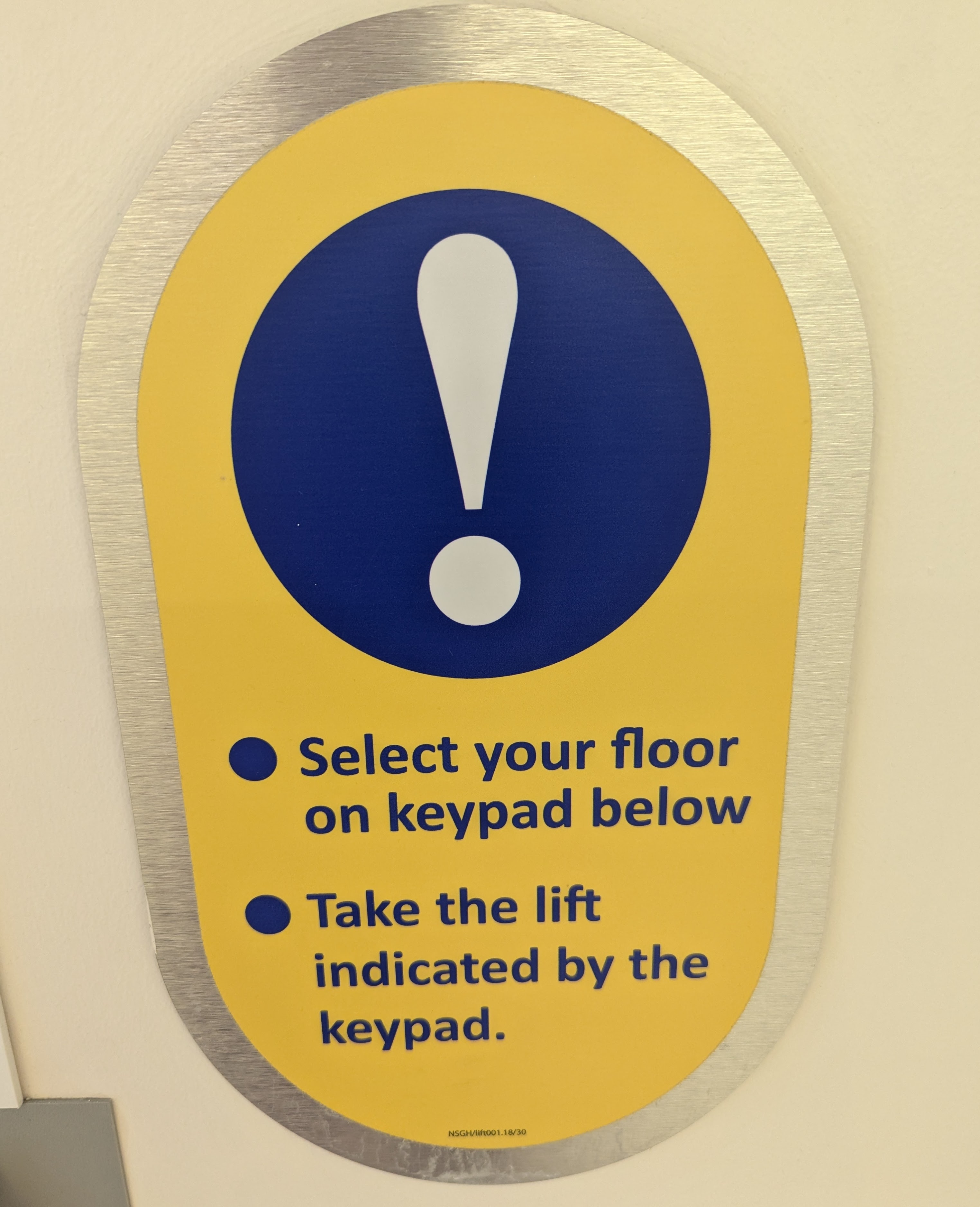
The official sign:
A longer prose version, printed on A4, put in a plastic sleeve and blue-tacked to the wall:

Another slightly less polished description of how to use the buttons, printed on A4 and blue-tacked again:

…with versions of these signs on every floor outside every lift.
Of course, nobody reads signs like these. But they suggest a flaw in design process, rather than any fault on the part of the people trying to get around the hospital.
In this case, a tiny amount of user research would reveal users (ill patients and stressed hospital visitors) becoming confused or irritated trying to work out how to do something that they thought they already knew how to do. Knowing that might lead to a tweak in the design to test again.
And that might lead to slightly calmer, slightly more punctual people in the hospital, and a maybe a few fewer signs stuck to the walls.
